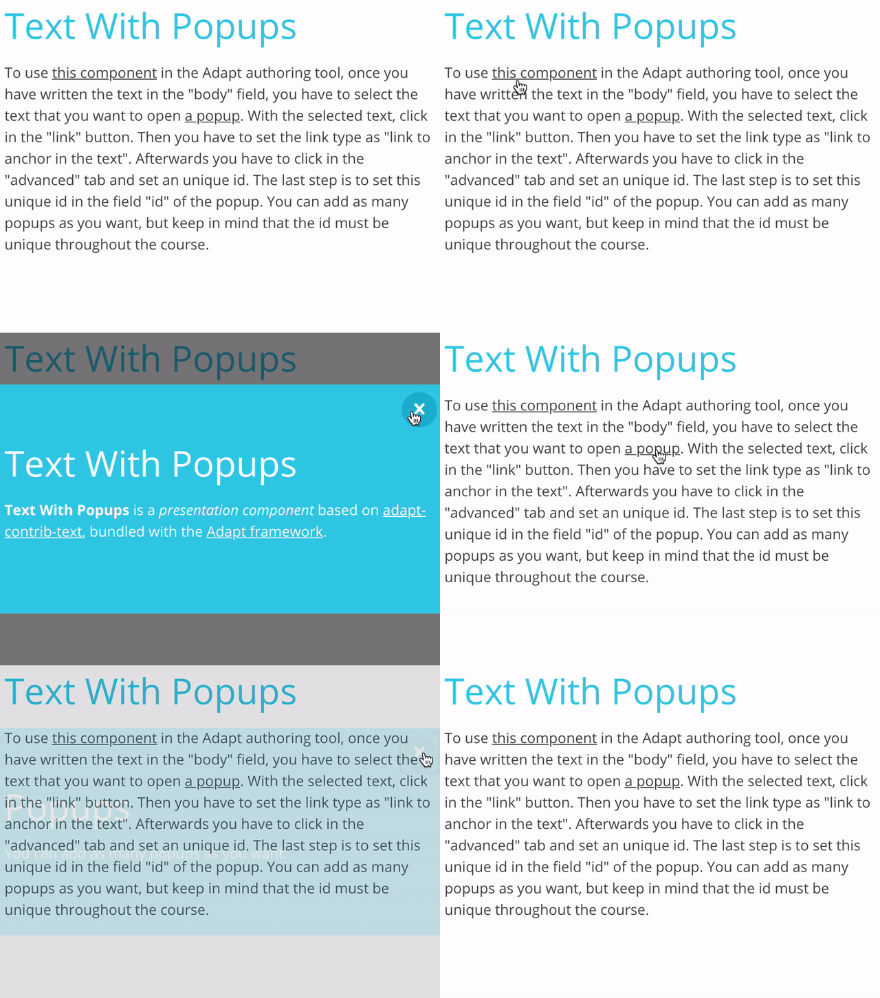
Text With Popups is a presentation component based on adapt-contrib-text, bundled with the Adapt framework.
Text With Popups' simple purpose is to present text with words that can be linked to open an integrated popup. The text may include HTML.
To use this component in the Adapt authoring tool, once you have written the text in the "body" field, you have to select the text that you want to open a popup. With the selected text, click in the "link" button. Then you have to set the link type as "link to anchor in the text". Afterwards you have to click in the "advanced" tab and set an unique id. The last step is to set this unique id in the field "id" of the popup. You can add as many popups as you want, but keep in mind that the id must be unique throughout the course.
Like all external compontents it has to be installed in the Adapt framework and in the Adapt authoring tool in order to be used.
With the Adapt CLI installed, run the following from the command line:
adapt install adapt-textWithPopups
Alternatively, this component can also be installed by adding the following line of code to the *adapt.json* file:
`"adapt-textWithPopups ": "*"`
Then running the command:
`adapt install`
(This second method will reinstall all plug-ins listed in *adapt.json*.)
In order to use Text With Popups in the Adapt authoring tool, you have to install it using the Plug-in Manager.
- If Text With Popups has been uninstalled from the Adapt framework or Adapt authoring tool, it may be reinstalled as above.
The attributes listed below are used in components.json to configure Text With Popups, and are properly formatted as JSON in example.json.
core model attributes: These are inherited by every Adapt component.
_component (string): This value must be: text.
_classes (string): CSS class name to be applied to Text’s containing div. The class must be predefined in one of the Less files. Separate multiple classes with a space.
_layout (string): This defines the horizontal position of the component in the block. Acceptable values are full, left or right.
title (string): A reference title for the component. title is distinct from the displayTitle which, if present, appears above the component. title provides the opportunity to use a shortened form in tighter spaces, such as in menus or in the drawer.
displayTitle (string): Optional text that will display as a title or header above the component. It can be used as a headline.
instruction (string): This optional text appears above the component. It is frequently used to guide the learner’s interaction with the component.
body (string): Although optional, this text constitutes what is thought of as the primary text of the Text component. HTML is permitted.
_isPopupOptional (boolean): This value is used when in the block settings you set the field "Is this optional?" to false. In this case if you set it to 'true' you do not have to open the popups to set the component to completed, otherwise you have to open all of them.
_items (array): Multiple items may be created. Each item represents one popup and contains values for the element (id, title, body).
id (string): This value is the identificator for this popup element.
title (string): This value is the title for this popup element.
body (string): This is the main text for this popup element. HTML is permitted.
No known limitations.
Version number: 1.0.0
Version number Plugin Based: 4.0.0
Framework versions: 5+
Author / maintainer: Singularlearning Team
Accessibility support: WAI AA
RTL support: Yes
Cross-platform coverage: Chrome, Chrome for Android, Firefox (ESR + latest version), Edge, IE11, Safari 12+13 for macOS/iOS/iPadOS, Opera

