Zipline Build a Personal Portfolio Webpage

Created by Rafase282
Github | FreeCodeCamp | CodePen | LinkedIn | Website | E-Mail
Build a CodePen.io app that successfully reverse-engineers this: Infinito Web Design Studio.
- Don't look at the example project's code on CodePen. Figure it out for yourself.
- You may use whichever libraries or APIs you need.
- Reverse engineer the example project's functionality, and also feel free to personalize it.
In software development and product management, a user story is a description consisting of one or more sentences in the everyday or business language of the end user or user of a system that captures what a user does or needs to do as part of his or her job function.
- As a user, I can access all of the portfolio webpage's content just by scrolling.
- As a user, I can click different buttons that will take me to the portfolio creator's different social media pages.
- As a user, I can see thumbnail images of different projects the portfolio creator has built (if you haven't built any websites before, use placeholders.)
- As a user, I navigate to different sections of the webpage by clicking buttons in the navigation.
Don't worry too much about not having anything to showcase, if you keep working on the FCC course, you will have plenty of projects to add to the portfolio.
Do not use templates for this zipline.
CodePen.io overrides the Window.open() function, so if you want to open windows using jQuery, you will need to target invisible anchor elements like this one: <a target='_blank'>.
- Every HTML5 document has to start with
<!DOCTYPE html> - You can add more fancy stuff if needed.
- The
headtags has the tile, links for stylesheets and the charset. I think you can also add the JS links.
<!DOCTYPE html>
<html>

<head>
  <meta charset="UTF-8">
  <title>Rafase282</title>
  <link rel='stylesheet prefetch' href='http://maxcdn.bootstrapcdn.com/bootstrap/3.3.5/css/bootstrap.min.css'>
  <link rel='stylesheet prefetch' href='https://maxcdn.bootstrapcdn.com/font-awesome/4.4.0/css/font-awesome.min.css'>
  <link rel="stylesheet" href="css/style.css">
</head>It has to stay at the top and be responsive so it does not take too much screen space on smaller devices. This navigation bar will turn into a dropdown menu on smaller screens. Furthermore, as you scroll down the page, the different tabs will be selected.
-
navbar-inverse: Makes it black instead of white. -
navbar-fixed-top: Makes it stay at the top. - 'container-fluid': Makes it fluid instead of fixed.
- 'class="navbar-toggle" data-toggle="collapse" data-target=".myNavbar"': This will make the buttons on a toggle style, and also make it collapse when the screen is small enough with the target being the buttons of the right side under the class 'myNavBar'
- The whole navbar is divided in two, one on the left for logo and name, and one of the right for the buttons.
- For the scrolling while toggling the proper button, the effect is linked by the
hrefwhich usesidso it would be good to useclassandidwith the same name. - The icons are added using
spanelements, and require bootstrap to be added to the site.
More about the Scrollspy plugin.
<!-- The scrollable area -->

<body data-spy="scroll" data-target=".navbar" data-offset="50">
  <!-- Navigation Part -->
  <nav class="navbar navbar-inverse navbar-fixed-top">
    <div class="container-fluid">
      <div class="navbar-header">
        <button type="button" class="navbar-toggle" data-toggle="collapse" data-target=".myNavbar">
          <span class="icon-bar"></span>
          <span class="icon-bar"></span>
          <span class="icon-bar"></span>
        </button>
        <a class="navbar-brand" href="#">Rafael Rodriguez</a>
      </div>
      <div class="collapse navbar-collapse myNavbar">
        <ul class="nav navbar-nav navbar-right">
          <li class="active">
            <a href="#home">
              <span class="glyphicon glyphicon-home"></span> Home</a>
          </li>
          <li>
            <a href="#experience">
              <span class="glyphicon glyphicon-info-sign"></span> Experience</a>
          </li>
          <li>
            <a href="#portfolio">
              <span class="glyphicon glyphicon-briefcase"></span> Portfolio</a>
          </li>
          <li>
            <a href="#contact">
              <span class="glyphicon glyphicon-comment"></span> Contact</a>
          </li>
        </ul>
      </div>
    </div>
  </nav>
Make sure to add https://cdnjs.cloudflare.com/ajax/libs/twitter-bootstrap/3.3.5/js/bootstrap.min.js to the JS part on CodePen so the dropdown menu for mobile works and also the glyphicons.
While I could have used <div></div> and give it a class to create the section. It is better to use html5 and use the section element.
Here is a diagram of it:
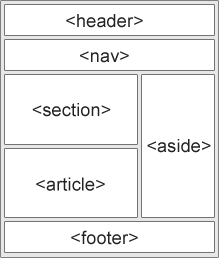
As you can see, there is no need to use div to create custom sections. For detailed information on the semantic elements check this.
- I gave the same name for the
classandidsince theidis used for the scroll effect on the tabs. -
img-responsiveWill make the image responsive. -
img-circlewill turn the image from whatever shape into a circle shape. -
displayedis used to center the image on the screen, check the CSS code. -
meis a class I created to identify that this is the photo with my face as it will behave differently as the images used on the portfolio. -
img-textis a class I created identify the text color for images.
<!-- Home -->
<section class="home" id="home">
  <h1>Rafael Rodriguez</h1>
  <h2>Creative Solutions</h2>
  <img class="img-responsive img-circle displayed me" src="https://avatars.githubusercontent.com/u/285138?v=3">
  <div class="img-text">
    <p>My name is Rafael Rodriguez. I’m a Computer Science graduate from Lehman College, NY. A single parent, co-founder of TealSeagull LLC (still cooking), I work as a freelancer for the time being, I write reviews, talk about my personal projects and
      even have two small books published at the moment.</p>
  </div>
</section>For this section I have used section and gave it a class and id with the same name for the reasons already explained.
- I used an accordion appearance using
collapsiblefrom bootstrap.
<!-- Experience -->
<section class="experience" id="experience">
  <div class="container">
    <h1>My Experience</h2>
      <p>Here is some of my past employment history.</p>
      <div class="panel-group" id="accordion">
        <div class="panel panel-default">
          <div class="panel-heading">
            <h4 class="panel-title">
              <a data-toggle="collapse" data-parent="#accordion" href="#collapse1">Freelancer UpWork</a>
            </h4>
          </div>
          <div id="collapse1" class="panel-collapse collapse in">
            <div class="panel-body">Over the past year I have polished and improved my Amazon services regarding publishing, eBook creation, ghostwriting, Amazon research, and technical support for Kindle services. Besides my writing experience with Amazon, I have also done
              blogs, articles, web research, and data entry jobs in occasions. I also work on the technical side and do plenty of help-desk related task, email handling, and QA for software and systems. I have experience in python, Go, java,and other
              programming languages, although I have done more web development recently. I put a lot of dedication in my work, however simple the task might be to ensure the work is done correctly and as fast as efficiently possible. I work full time
              as a freelancer so I'm easy to reach any day.</div>
          </div>
        </div>
        <div class="panel panel-default">
          <div class="panel-heading">
            <h4 class="panel-title">
              <a data-toggle="collapse" data-parent="#accordion" href="#collapse2">Independent Contrator for NYC Board of Education</a>
            </h4>
          </div>
          <div id="collapse2" class="panel-collapse collapse">
            <div class="panel-body">November 2014 – Present (10 months)
              <h5>Job Responsibilities
                <h5>
                  I provide Help-desk and other on demand solutions to the NYC public schools. Currently I have worked on M.S. 219, setting up a computer lab for the school, upgrading and setting up iPads and other Help-desk related tasks.
            </div>
          </div>
        </div>
        <div class="panel panel-default">
          <div class="panel-heading">
            <h4 class="panel-title">
              <a data-toggle="collapse" data-parent="#accordion" href="#collapse3">Information Technology Intern</a>
            </h4>
          </div>
          <div id="collapse3" class="panel-collapse collapse">
            <div class="panel-body">
              September 2010 – July 2014 (3 years 11 months) Bronx, NY
              <h5>Job Responsibilities</h5>
              <ul>
                <li>Assist in the setup of new computer equipment in classroom and offices.</li>
                <li>Install software.</li>
                <li>Ensure that LCD projector, smart boards, and other related audio/video equipment remains functional.</li>
                <li>Troubleshoot hardware and software problems in conjunction with Department of Education (DOE) Help Center and borough technology staff.</li>
                <li>Configure wireless devices to access DOE network.</li>
                <li>Maintain classroom servers.</li>
                <li>Maintain technology equipment inventory.</li>
                <li>Monitor equipment in the technology laboratory.</li>
                <li>Coordinate with MOUSE Squad, if applicable.</li>
                <li>Local and network ghosting.</li>
                <li>Troubleshoot and setup network printers.</li>
                <li>Network administrator for Windows Server 2008.</li>
                <li>Desktop support for teachers.</li>
              </ul>
            </div>
          </div>
        </div>
      </div>
  </div>
</section>
The portfolio section is a bit more complicated. It uses columns to align the images and information evenly.
- First we need a container div:
<div class="container"> - Then we need rows, I only need one row.:
<div class="row"> - Then we start with the columns, each column must be closed before we open another one.:
<div class="col-md-3"> - I also use a well to contain the information. :
<div class="well"> - I also created a new class to add gray text to elements.:
<h2 class="gray-text">Project Title</h2>and<p class="gray-text"> - I got the images from this site.
<!-- Portfolio -->
<section class="portfolio" id="portfolio">
  <h1>Portfolio</h1>
  <p>My upcoming projects will be here!</p>
  <div class="container">

    <!-- Example row of columns -->
    <div class="row">
      <div class="col-md-3">
        <div class="well">
          <a href="http://codepen.io/Rafase282/full/yNmerP/" class="thumbnail">
            <img src="http://dev.tealseagull.com/Rafael/img/Screenshot%202015-08-25%2001.39.17.png" alt="Project 1">
            <h2 class="gray-text">Random Quote Generator</h2>
          </a>
          <p class="gray-text">This site will display random quotes using the <a href="http://forismatic.com/" target="_blank" style="color: orange">Forismatic</a> API. You will then have the option to tweet it and share with others. You might need to edit the the psot
            before summiting as some quotes will go over the limit. </p>
        </div>
      </div>
      <div class="col-md-3">
        <div class="well">
          <a href="#" class="thumbnail">
            <img src="http://dev.tealseagull.com/Rafael/img/sports-h-c-171-180-6.jpg" alt="Project 2">
            <h2 class="gray-text">Project Title</h2>
          </a>
          <p class="gray-text">Lorem ipsum dolor sit amet, consectetur adipiscing elit, sed do eiusmod tempor incididunt ut labore et dolore magna aliqua. Ut enim ad minim veniam, quis nostrud exercitation ullamco laboris nisi ut aliquip ex ea commodo consequat. Duis aute
            irure dolor in reprehenderit in voluptate velit esse cillum dolore eu fugiat nulla pariatur. Excepteur sint occaecat cupidatat non proident, sunt in culpa qui officia deserunt mollit anim id est laborum.</p>
        </div>
      </div>
      <div class="col-md-3">
        <div class="well">
          <a href="#" class="thumbnail">
            <img src="http://dev.tealseagull.com/Rafael/img/technics-h-c-171-180-1.jpg" alt="Project 3">
            <h2 class="gray-text">Project Title</h2>
          </a>
          <p class="gray-text">Lorem ipsum dolor sit amet, consectetur adipiscing elit, sed do eiusmod tempor incididunt ut labore et dolore magna aliqua. Ut enim ad minim veniam, quis nostrud exercitation ullamco laboris nisi ut aliquip ex ea commodo consequat. Duis aute
            irure dolor in reprehenderit in voluptate velit esse cillum dolore eu fugiat nulla pariatur. Excepteur sint occaecat cupidatat non proident, sunt in culpa qui officia deserunt mollit anim id est laborum.</p>
        </div>
      </div>
      <div class="col-md-3">
        <div class="well">
          <a href="#" class="thumbnail">
            <img src="http://dev.tealseagull.com/Rafael/img/technics-h-c-171-180-10.jpg" alt="Project 4">
            <h2 class="gray-text">Project Title</h2>
          </a>
          <p class="gray-text">Lorem ipsum dolor sit amet, consectetur adipiscing elit, sed do eiusmod tempor incididunt ut labore et dolore magna aliqua. Ut enim ad minim veniam, quis nostrud exercitation ullamco laboris nisi ut aliquip ex ea commodo consequat. Duis aute
            irure dolor in reprehenderit in voluptate velit esse cillum dolore eu fugiat nulla pariatur. Excepteur sint occaecat cupidatat non proident, sunt in culpa qui officia deserunt mollit anim id est laborum.</p>
        </div>
      </div>
    </div>
  </div>
</section>This section has two main elements. A Twitter feed widget which I got from the official website, and the social buttons that I created.
Since there were many of them, it was a problem for smaller screen to keep them both in the same row so instead I aligned them at the center and vertically.
- I used
align="center"to make things centered, for example<div class="social" align="center"> - The group of buttons to be aligned vertically needs a
<div class="btn-group-vertical"> - I used Font Awesome icons,
<i class="fa fa-envelope fa-fw"></i>
<!-- Contact -->
 <section class="contact" id="contact">
   <div class="contact-info">
     <h1>Contact Me</h1>

     <!-- Twitter feed widget -->
     <div id="twitter-feed" align="center">
       <a class="twitter-timeline" href="https://twitter.com/Rafase282" data-widget-id="634855727186767876">Tweets by @Rafase282</a>
     </div>

     <!-- social media buttons -->
     <div class="social" align="center">
       <div class="btn-group-vertical">
         <button type="button" class="btn btn-primary"><i class="fa fa-envelope fa-fw"></i>
           <a href="mailto:[email protected]"></a> E-mail</button>
         <button type="button" class="btn btn-primary"><i class="fa fa-github fa-fw"></i>
           <a href="https://github.com/Rafase282" target='_blank'></a> GitHub</button>
       </div>
       <div class="btn-group-vertical">
         <button type="button" class="btn btn-primary"><i class="fa fa-linkedin"></i>
           <a href="https://www.linkedin.com/in/rafase282" target='_blank'></a> LinkedIn</button>
         <button type="button" class="btn btn-primary"><i class="fa fa-codepen"></i>
           <a href="http://codepen.io/Rafase282" target='_blank'></a> CodePen</button>
       </div>
       <div class="btn-group-vertical">
         <button type="button" class="btn btn-primary"><i class="fa fa-fire fa-fw"></i>
           <a href="http://www.freecodecamp.com/rafase282" target='_blank'></a> FreeCodeCamp</button>
         <button type="button" class="btn btn-primary"><i class="fa fa-wordpress"></i>
           <a href="https://rafase282.wordpress.com/" target='_blank'></a> WordPress</button>
       </div>
     </div>
   </div>
</section>This is a simple section, nothing fancy here, html wise.
<!-- The footer -->
<footer>
  <p>Copyright © Rafael J. Rodriguez 2015. All Rights Reserved</p>
</footer>Here is where the JS scripts are, right after we close the body, but before we close the html.
</body>

<script src='http://cdnjs.cloudflare.com/ajax/libs/jquery/2.1.3/jquery.min.js'></script>
<script src='http://maxcdn.bootstrapcdn.com/bootstrap/3.3.5/js/bootstrap.min.js'></script>
<script src="js/index.js"></script>

</html>We make the position to be relative to make things fluid.
body {
  position: relative;
}- We make it has a minimum height of 10% of screen view. Learn more here.
- We use
padding-topandpadding-bottomto give space above and bellow so things don't look cramped. - I made the text color to be gray for visibility since I made the background color to be black.
footer {
  min-height: 10vh;
  padding-top: 40px;
  padding-bottom: 10px;
  color: gray;
  background-color: black;
}Make it all centered.
h1, h2, p {
  text-align: center;
}This will give a font color of white to a tags and gray to custom classes that I created earlier.
a {
  color: white;
}
.gray-text {
  color: gray;
}
.project-text {
  color: gray;
}
.panel-body {
  color: black;
}I tried to use jQuery to give some animation but instead I used the opacity property and gave it a default value and when I hover over an image it changes opacity while the mouse is inside using :hover I also specified for which images using the thumbnail class. More info.
img {
  opacity: 1.0;
  filter: alpha(opacity=100);
  /* For IE8 and earlier */
}
.thumbnail img:hover {
  opacity: 0.4;
  filter: alpha(opacity=40);
  /* For IE8 and earlier */
}This will make the image a particular size, with a fixed margin, and border style and color. The displayed part makes it stay at the center.
.me {
  width: 250px;
  height: 250px;
  margin-top: 50px;
  border-width: 5px;
  border-style: solid;
  border-color: gray;
}
.displayed {
  display: block;
  margin-right: auto;
  margin-left: auto
}I had to get some things to be centered, like certain text, or move certain parts of the navigation bar towards certain direction. This is the code used.
.img-text {
  margin-top: 50px;
  margin-bottom: 50px;
  padding-right: 30%;
  padding-left: 30%;
}
.social {
  padding-top: 10px;
}
.navbar-header {
  padding-left: 10%;
}
.navbar-right {
  padding-right: 10%;
}- I made them all take the full screen view with
min-height: 100vh;. I usedmin-heightinstead of justheightbecause the first one no matter how you resize the elements on the screen, they will not bleed over the others, it will make sure the looks stay consistent. This is very important. - I also gave text color and different background colors to each section.
- For the contact section I had to change some values. I wanted the contact section to show the footer too. So I had to adjust to 90-10 ratio on the
min-height. - For the
contact-infowhich is what has the widget and buttons, I gave it some space too on real screen state to keep things neat.
.home {
position: relative;
min-height: 100vh;
padding-top: 10%;
padding-bottom: 10%;
color: #fff;
background-color: #1E88E5;
}
.experience {
min-height: 100vh;
padding-top: 10%;
padding-bottom: 10%;
color: #fff;
background-color: #009688;
}
.portfolio {
min-height: 100vh;
padding-top: 10%;
padding-bottom: 10%;
color: #fff;
background-color: #ff9800;
}
.contact {
min-height: 90vh;
padding-top: 10%;
padding-bottom: 50px;
color: #fff;
background-color: #00bcd4;
}
.contact-info {
max-width: 80vh;
min-height: 60vh;
margin: auto;
}Here I just paste the JavaScript part of the widget.
/* Twitter feed code
 *
 */
!(function (d, s, id) {
  var js = d.getElementsByTagName(s)[0]
  var fjs = d.getElementsByTagName(s)[0]
  var p = /^http:/.test(d.location) ? 'http' : 'https'
  if (!d.getElementById(id)) {
    js = d.createElement(s)
    js.id = id
    js.src = p + '://platform.twitter.com/widgets.js'
    fjs.parentNode.insertBefore(js, fjs)
  }
})(document, 'script', 'twitter-wjs')