-
Notifications
You must be signed in to change notification settings - Fork 15
New issue
Have a question about this project? Sign up for a free GitHub account to open an issue and contact its maintainers and the community.
By clicking “Sign up for GitHub”, you agree to our terms of service and privacy statement. We’ll occasionally send you account related emails.
Already on GitHub? Sign in to your account
Optimize the layout of the newIssueWelcomeComment #14
Comments
|
Thank you for opening your first issue in this project! Engagement like this is essential for open source projects! 🤗 |
|
I think it is a good suggestion and I see the value of saving some vertical space for readability! Thank you @krassowski for exploring this technically as well, your solution @GeorgianaElena what do you think? |
|
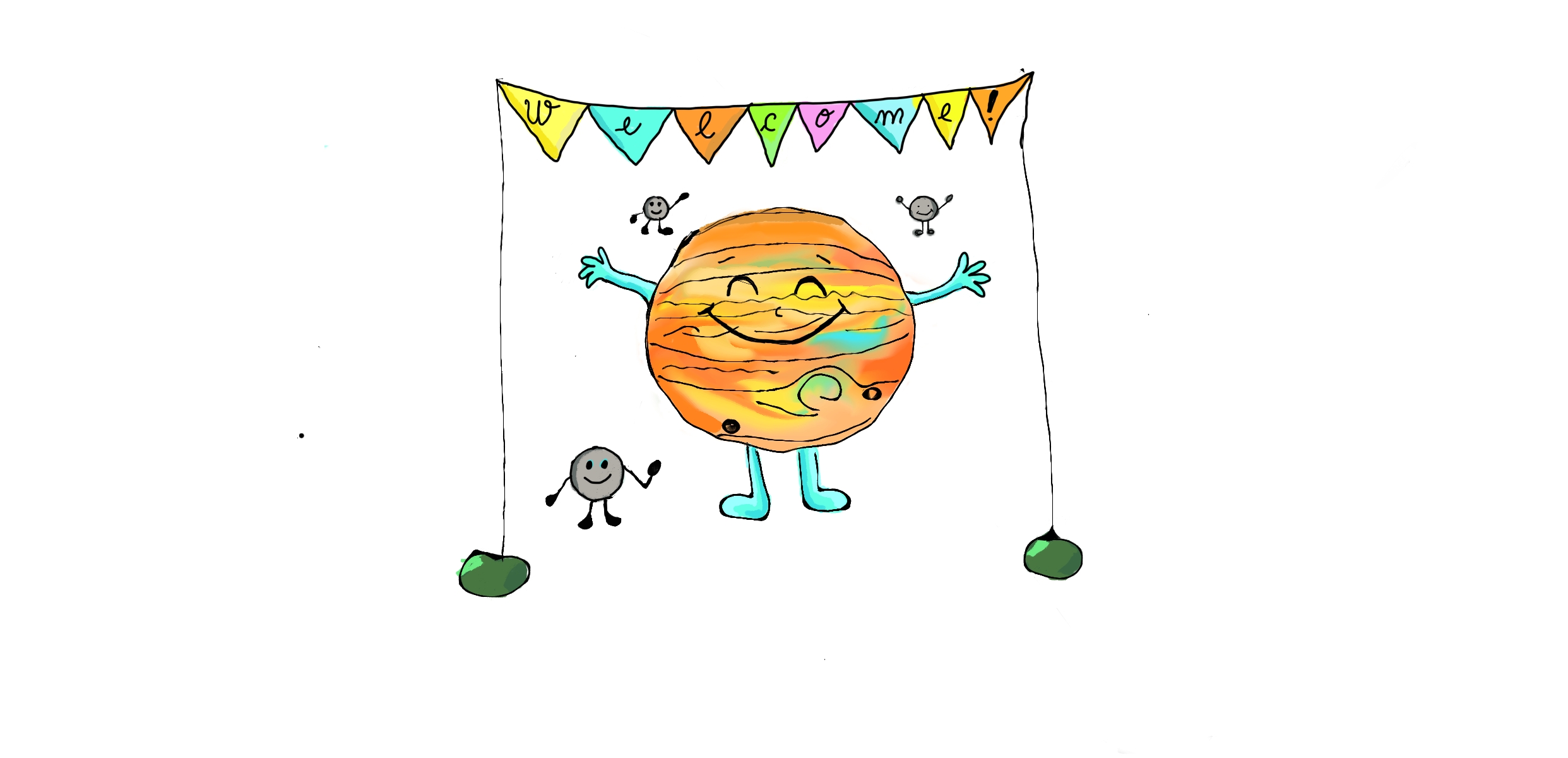
👍 I like the suggestion too! Thanks @krassowski! Not sure if any of you are using the GitHub mobile app or if this is even relevant, but I want to share this, because this was where I read this thread initially and was a bit confused about the image presence in @consideRatio's message :D This is how the message, with the image on the right looks like on my phone: It doesn't seem very different from a bot's regular message, but I think it's ok if the text will come before. |
|
I think it's a good idea! |
|
It seems like the suggested solution is the same when using mobile :) which is fine i think |
|
Georgiana can you make a version of the image with smaller white space on each side? If you post it here I can try and make a PR, or you directly make a PR to update it and I merge it :D |
|
I don't have the program I created the drawing anymore :( |


The current
newIssueWelcomeCommentcomment is a tad long on my screen. I wonder if it would be a good idea to move the picture to the right and remove the white (empty) stripes on sides.Current
Proposed
In addition to saving my fingers from scrolling to subsequent comments, it also makes the text a bit more prominent (one can fail to notice the text under the image in the current version).
Who would use this feature?
This is for both @jupyterlab and @jupyterhub I suppose.
(Optional): Suggest a solution
To prepare the proposed screenshot I just moved the
<img>to the beginning and played with CSS:Sadly, GitHub sanitizer does not allow custom CSS, so in the actual solution, we need to use the allowed
<img>attributes:Where the src should point to
https://raw.githubusercontent.com/jupyterhub/orhttps://raw.githubusercontent.com/jupyterlab/respectively. The actual image should be modified (trimmed) beforehand too.The text was updated successfully, but these errors were encountered: